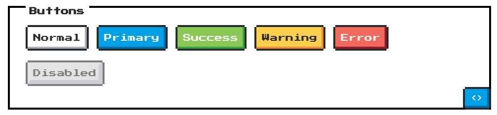
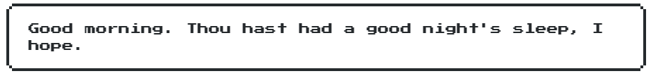
Recently I came across a new CSS library called NES.css which is designed to mimic retro games from systems like NES and Gamecube. Below are some examples of the library showing off the pixelated style so recognizable with retro games.
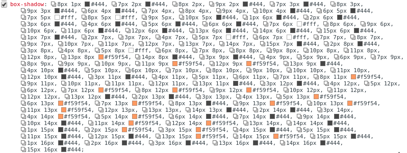
The second I found this library I wanted to help it grow and make it better. One of the biggest areas we needed to work on was the way Icons (some seen above) were drawn. The creator of the library B.C. Rikko originally implemented them using only CSS box-shadows. This is a really clever idea as it allows people to use the library without having to rely on any actual image files. The problem with this is that the output box-shadow property in the css file was huge to account for the location and color of every pixel. It was also essentially duplicated 3 times to account for each size of the icon.
This looks horrible to hand code and it would be however since the library is written using Sass @bcrikko had created a mix-in to auto-generate the shadows based off an array of colors and a two dimensional array of pixels where each color should go.
Given all of that one of the first changes I wanted to make was to help reduce the size of the CSS file to reduce the overhead that the library adds to anyone wishing to use it. To accomplish this I played around with how box shadows work and realized that they default to the current text color of the element it’s applied to and that positioning can be based off of the font-size. Incorporating these ideas I altered the box-shadow generation mix-in to set the elements color to the most used on to eliminate four to 6 characters every place those colors were needed. I also altered the positioning from using pixels to using ems which allowed me to eliminate duplication of the box-shadow and just alter the font-size on the element to change the size of the icon. Also because everything is rendered through CSS it can scale endlessly without losing resolution